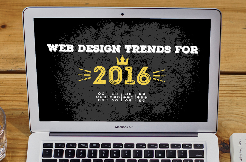
In the dynamic web industry trends don’t last very long. New and exciting concepts, techniques, and tools are constantly being introduced. Creative minds are always working hard to keep the industry fresh by challenging norms and developing innovative new styles. In other words, a lot can change in a year, and as 2015 comes to an end, Tipping Point has an eye on 2016-2017 and what a new year could bring to the table for the world of web design. As any web designer knows, keeping your finger on the pulse of the industry is incredibly important. What new trends will we see pop up and which trends will finally be laid to rest? Continue reading as we explore what 2016-2017 could have to offer for the wonderful world of web design.
Overall Design Theme For 2016-2017: Differentiation
Google’s ‘Mobilegeddon’ update forced responsive web design to become ubiquitous around the web. We’ve reached a point where the majority of “pretty websites” all look the same, but we believe that’s all going to change in 2016. In fact, we predict this upcoming year will bring more well thought out and unique user experiences. How’s so? We have a couple of ideas in mind that we believe will start to trend.
1) Storytelling
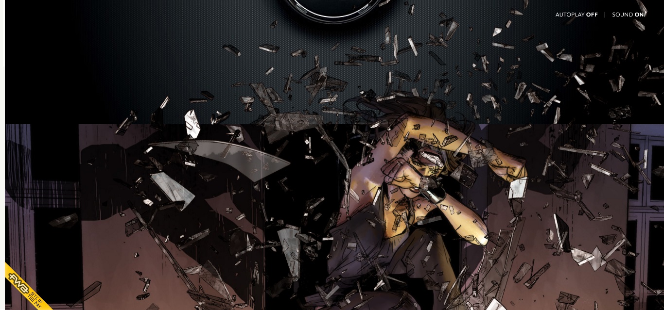
Designers are giving users rich, unique experiences through the use of visual storytelling. Storytelling through means of a website can be quite a complex endeavor, but it’s not impossible. We absolutely love Peugeot’s Hybrid Graphic novel. The site does a beautiful job of entertaining users with a scroll-able interactive graphic novel while also allowing them to learn about Peugeot’s HYbrid4 technology. We highly recommend you visit this site if you haven’t already. It’s a blast to scroll through and it serves as great inspiration for interactive web storytelling that makes learning fun.
2) Semi-flat Design
After Windows launched its Metro style, the design world became inundated with flat design. However, flat design did come with some pitfalls and has slowly been morphing into semi-flat design to correct usability issues. By integrating depth and dimension through the use of subtle shadows, cards, and well-thought out transitions, semi-flat design has become a much better design alternative due to its ease of usability. Semi-flat design appears to alleviate all of the problems caused by flat design and we expect to see much more of it in 2016-2017.
3) Custom-Made Illustrations
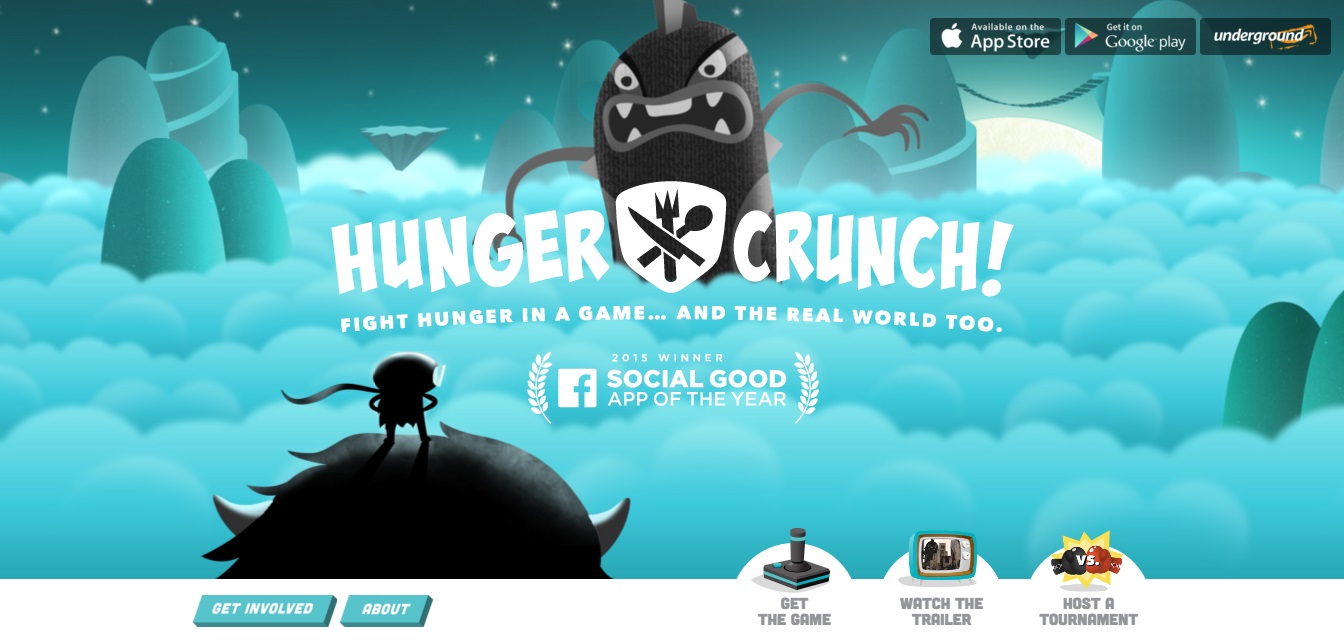
“Why should I design another _____ icon when I can just grab it off an already existing vector pack from the web?” This line of thinking crosses designers minds on a daily basis and there is merit to it. Stock icons and illustrations save time and money, but why not include extra time and money for custom-made illustrations in the first place?
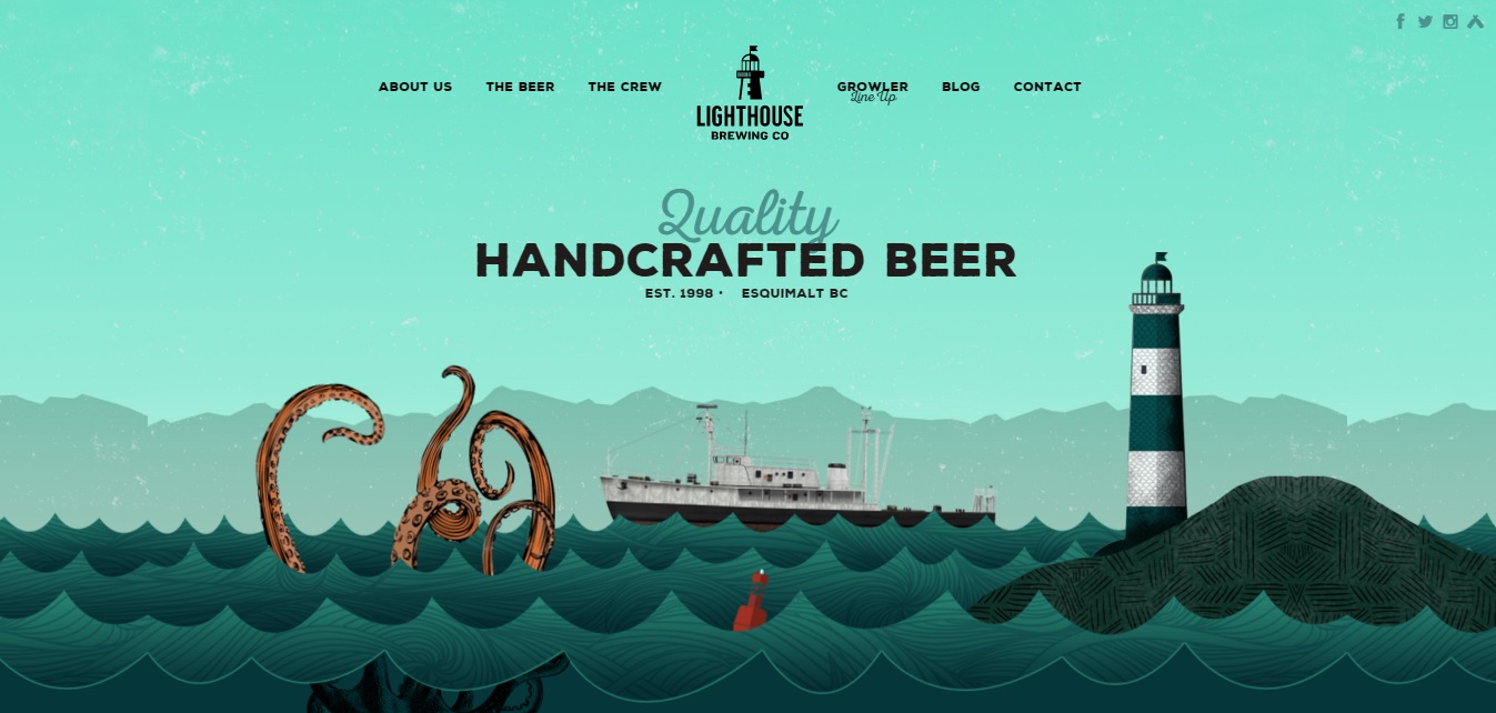
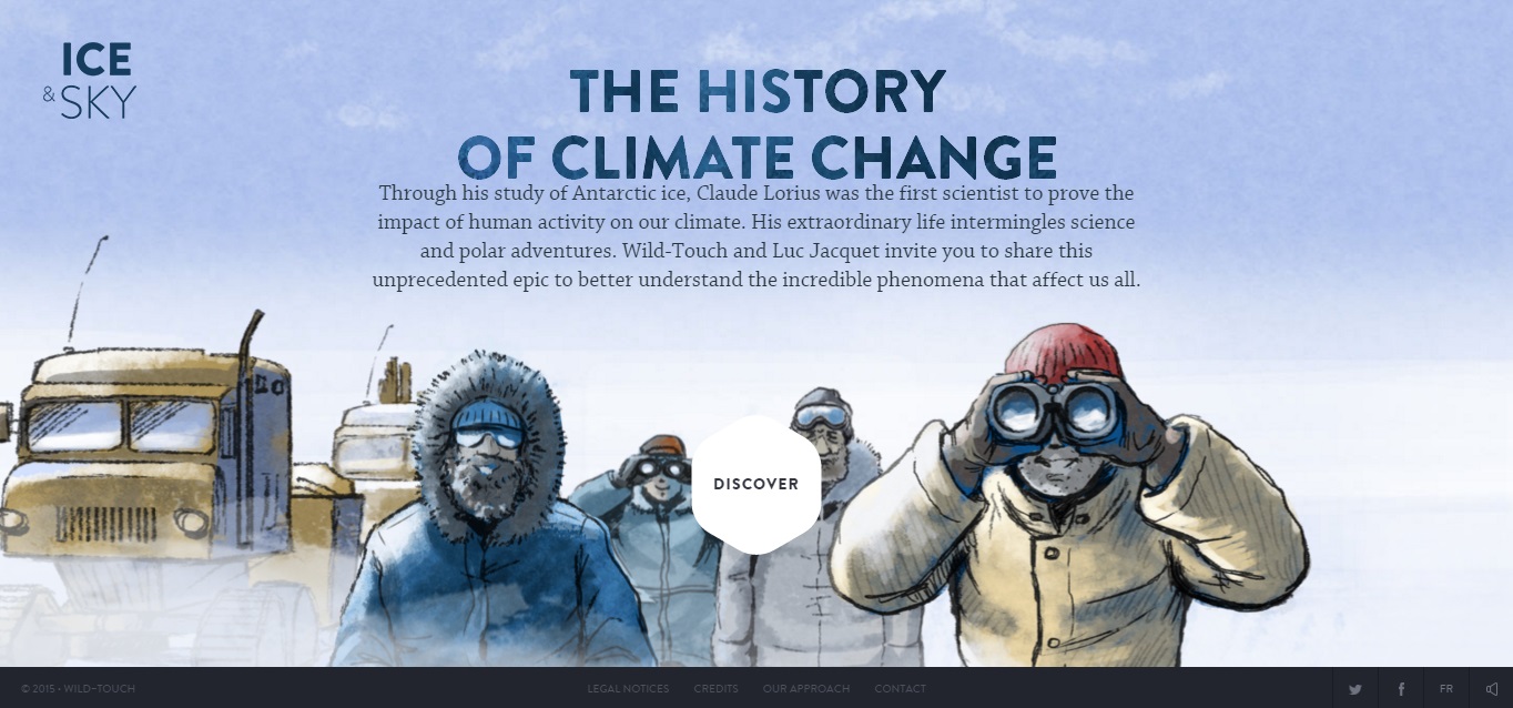
Sites like lighthousebrewing.com, hungercrunch.com, and iceandsky.com all feature custom/hand-drawn illustrations that add an extra layer of visual appeal and create a truly unique website experience. We predict that sites will be implementing more custom-made features and illustrations to differentiate themselves from the herd of cookie cutter websites.
4) Unique Grid Use
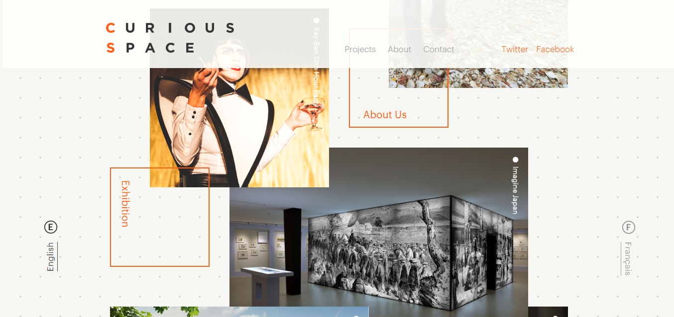
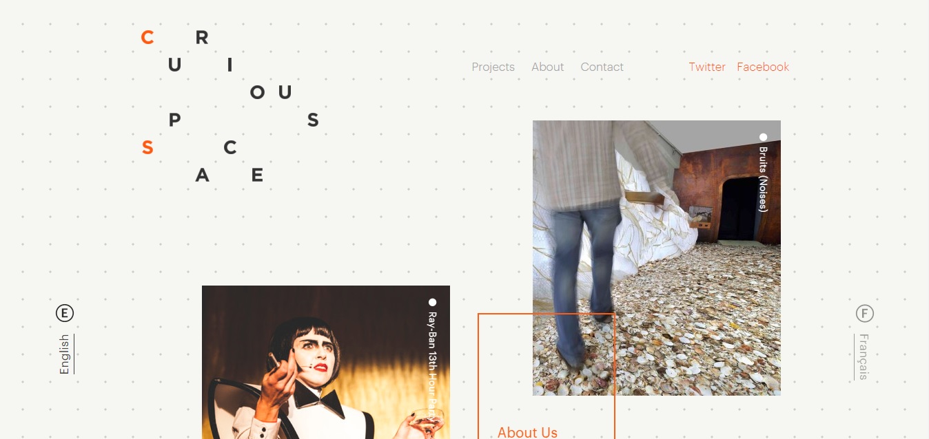
Curious Space’s website serves as the perfect example for creative grid design. One of the first things that may jump out at you is the fact that the images are stacked on top of each other. Stacking images isn’t a problem, because as the user rolls over an image the z-index of the image shifts bringing the photo to the top of the pile. Additionally, upon first entering the site the logo appears in a haphazard arrangement (see below image), but after scrolling further down the page everything aligns into place spelling out Curious Space. Be sure to visit this site for inspiration on adding a pinch of organic freedom to an ordered grid layout.
5) Cinemagraphs

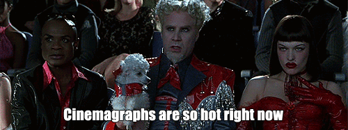
Remember when we posted about cinemagraphs and their use in social media? Cinemagraphs are extremely powerful visuals. They enhance the desired mood of a website and give sites an additional layer of wonder, mystique, and elegance. We haven’t even gotten to the best part yet. Cinemagraphs are better than videos because they don’t eat up as much bandwidth, and they’re certainly much better than photos, because they provide something more than a simple still shot. This technology isn’t new, but we do expect to see it integrated into more websites in the coming year, because let’s face it…cinemagraphs are so hot righ now.
6) Widespread Parallax Adoption
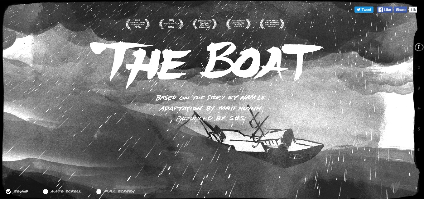
In case you’re not already familiar with parallax, parallax is a type of effect applied to the speed and movement of background imagery. The background of the website moves at a different speed than the rest of the page which gives sites the illusion of depth. As computers and related technology get better at handling such effects, we can certainly expect to see more websites utilizing them. To see parallax in action, check out Peugeot’s hybrid graphic novel which we mentioned earlier, or The Boat. The Boat plays out much like the hybrid graphic novel, but is based on a story written by Nam Le. As you scroll the story unfolds and different website elements fall into place to illustrate the events taking place. If you have some free time and are in the mood for a good story, The Boat is certainly a site worth checking out.
7) Lazy Loading
Lazy loading aids in viewing content immediately without waiting for an entire page to load. This technique is utilized on sites that feed content such as Facebook, Instagram, or Twitter. In a society where information is constantly being fed into our lives, lazy loading helps to simplify viewing said content one chunk at a time. Being that load speed is important for both SEO and website conversion rates, we expect more widespread utilization of lazy loading in 2016-2017.
8) Centered/Split Content
Centered content is a powerful style that will become ever more prevalent on home pages. Centered content places the main message smack dab at the center of the screen with striking visuals or smooth textures surrounding it to create a dramatic visual effect. This layout works brilliantly for pages with minimal content like home pages. However, pages with more substance will more than likely also be getting a face lift with split content layout design. Split content divides the screen into wide sections. The major benefit to the split content design is that look of each section can very greatly without being dictated by a single aesthetic tone. This in turn gives designers more creative freedom without threatening the clarity of content hierarchies.
Do You Agree?
These are all of the trends we believe will be big for web design in 2016-2017, but we want to hear from all of you! Do you agree with us? Are there trends we haven’t foreseen that you believe will be big this upcoming year? Drop us a comment with your thoughts in the section below. Regardless of whether we’re right or wrong, 2016 looks to be an exciting year for web design.