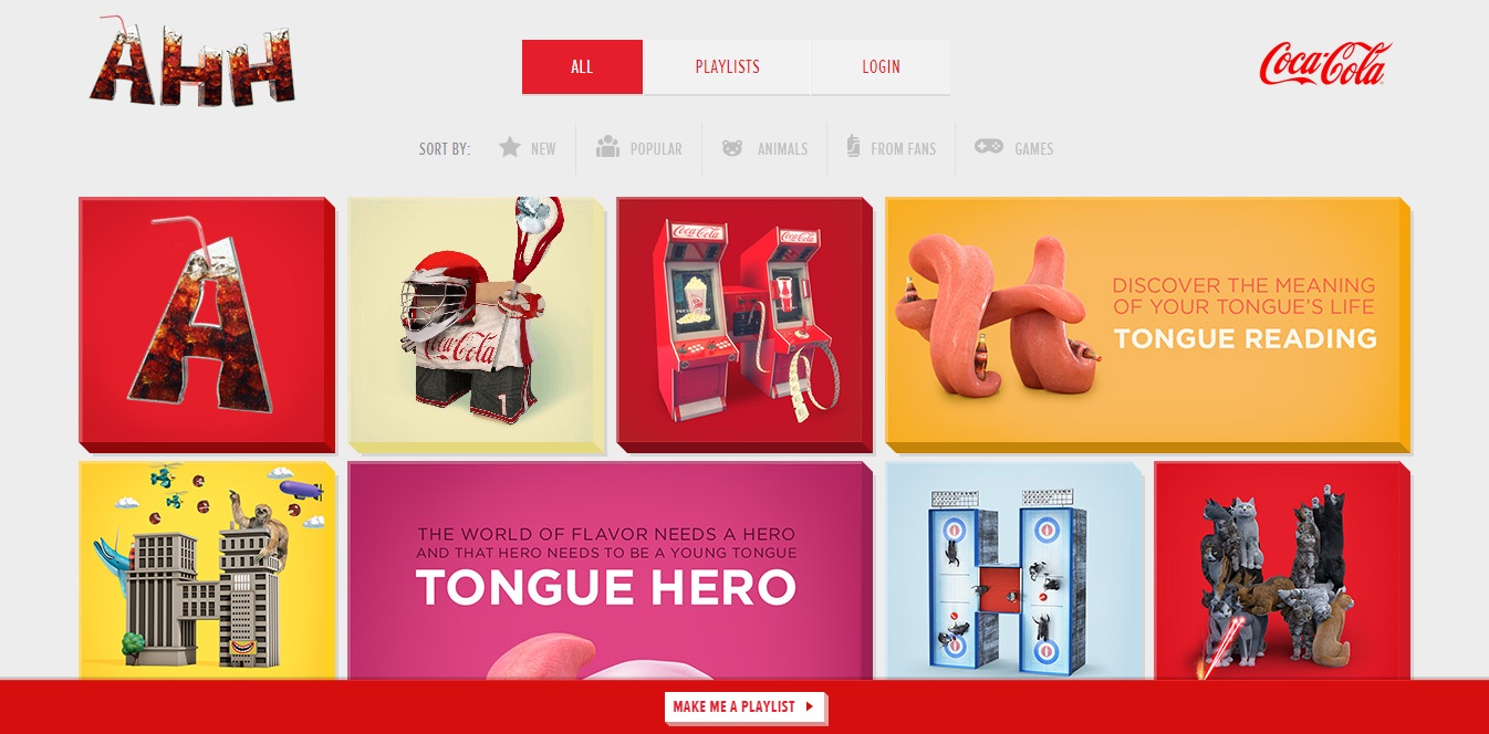
We are currently in the midst of a re-architecture of the web. A new trend has emerged from the rise of popular design techniques such as mobile responsive design and flat design. From social media to real estate websites, cards are fast becoming a popular web design technique. You encounter card design all over the web without even realizing it. Cards have been so successful in web design that they’re slowly becoming the default option when it comes to balancing clear aesthetics with simple usability. Indeed, there’s a good reason why card design has become so popular and you may want to consider implementing a card-based layout for your next project.
What Are Cards?
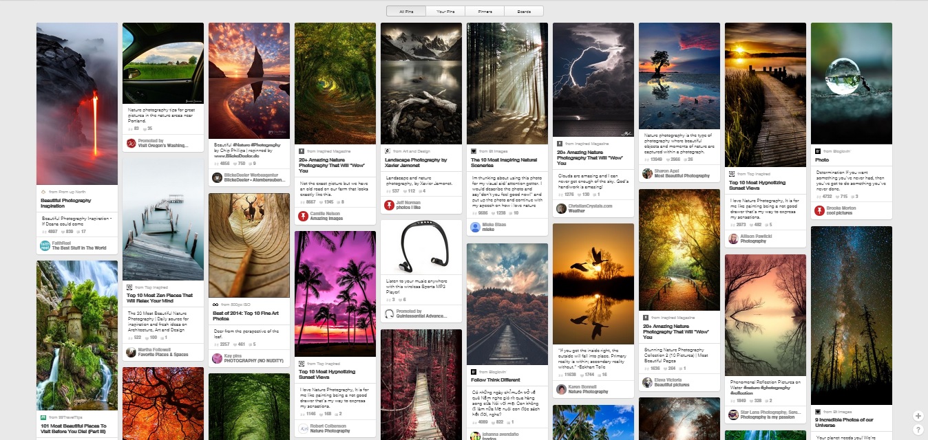
Simply put, cards are a separate containers of components. Cards come in many different shapes, colors, and forms, but they all include similar components. Cards are comprised of images, text, and icons. In a sense, cards are miniature, condensed web pages. The key to card development is simplicity. A card is seldom complex and its purpose is to entice users to click through it. Cards were first popularized by the image-sharing site Pinterest. As you can see below each post represents a card that can be moved and manipulated.
Take note of the simplicity. Each card contains an image, caption, username, and profile picture. Since, Pinterest’s adoption many other sites have followed suit integrating card-based layouts into their websites. Cards came to the forefront of web design when social media giants Facebook, and Twitter each adopted card driven interfaces for their sites.
Why Use Cards?
There are several undeniable benefits to using cards from both a functionality and aesthetic perspective. When it comes to practical and slick results, the card design takes some beating. Here are a few benefits to using cards in web design:
1) Cards Enhance Responsive Design
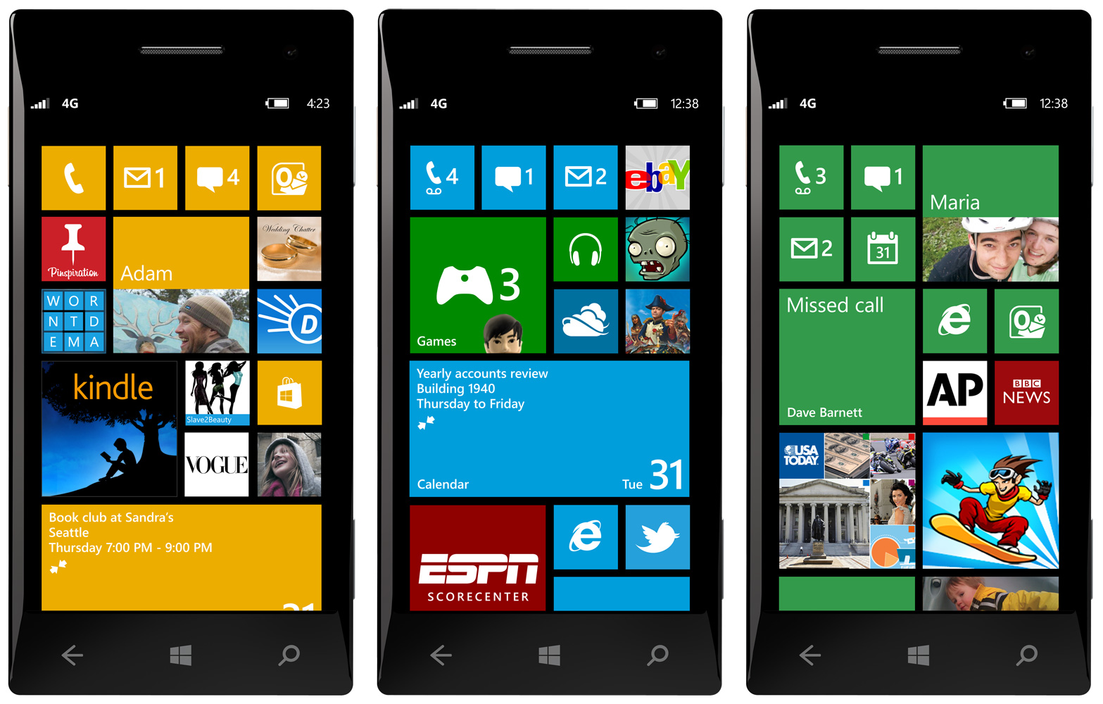
With the occurrence of Mobilegeddon earlier this year, we all now understand the importance of responsive design. It’s crucial that your site looks, and performs well across all popular viewing devices. Cards make responsive design that much easier, because they were designed for exactly that purpose. Cards help reposition and reorder content quickly and easily to tailor to the size of the screen. One great example of this would be Windows Phones with Windows 8. Windows 8 runs on a card based system where each app has a card. Those cards can be rearranged to fit on different screen sizes and they can even be rearranged to fit the user’s preference. This actually segways perfectly into the next benefit of card-based design.
2) Cards Keep Things Organized
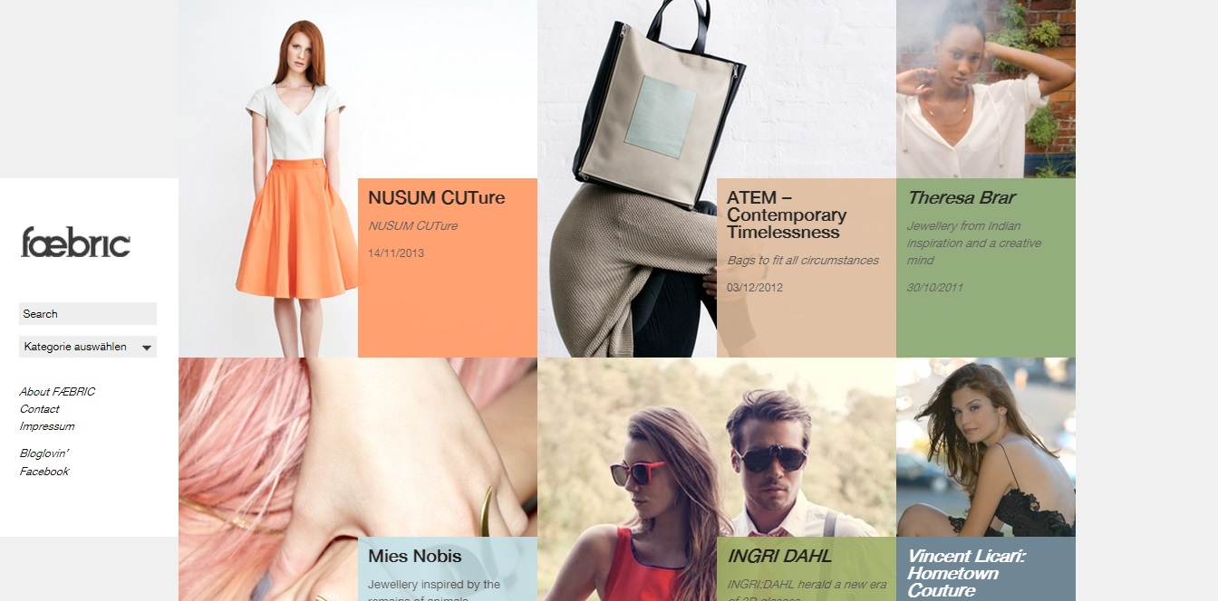
Cluttered websites are an utter headache. Card design offers fantastic precision when it comes to organizing content from varying sources. This organization can be very helpful for both designers and users. For organizational inspiration, take a look at Kelsey Drake‘s website, which is organized to perfection.
3) Cards Are Easy To Digest
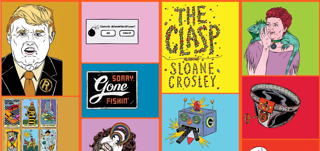
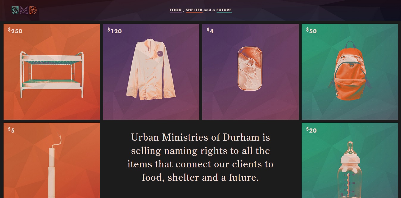
One of the most important features of card design is its simplicity. Cards don’t contain a whole lot of information which makes them intriguing, enticing, and easy to browse through. Take a scroll through NamesForChange.org. Each card is easy to read and interact with.
4) Cards Are Rank-Free
In card design, equality is everything. Each card carries equal weight, which means there’s no need to meticulously rank all your content.
5) Card Design Is Universal
Card design is extremely flexible and works for almost any type of content. There are no specific rules when it comes to designing a card-based layout either, which means there’s plenty of room for creativity and experimentation.
How Can You Use Cards?
If you want to make card design work for your websites, there are a few things you need to keep in mind in order to get your design right.
1) White Space Is Everything
The first thing you want to avoid is a cluttered feel. When designing your cards make sure to leave room for a lot of white space or negative space.
2) Detail Is Important
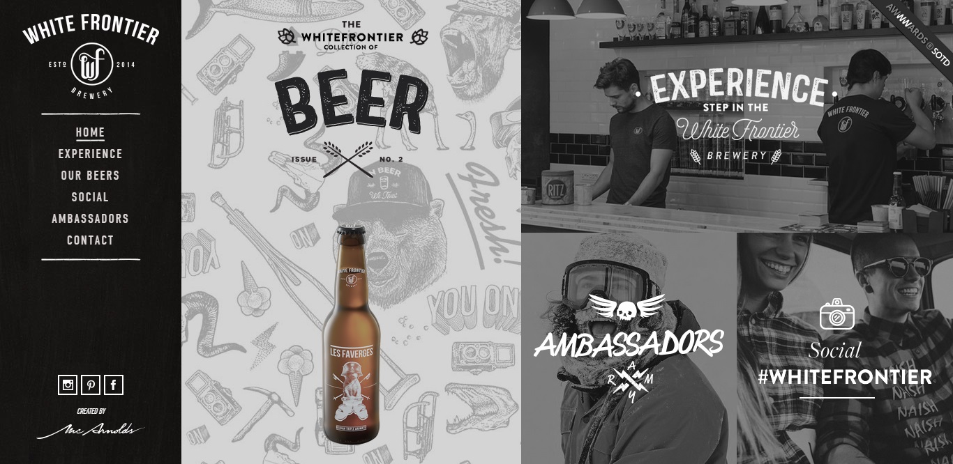
Card design is all about keeping things simple, but the details are still important. Don’t be afraid to add a personal touch to make your cards stand out. Implement eye-catching animations, unique color palettes, and fancy fonts. White Frontier does a fantastic job of putting their own personal spin on card design. Each card is beautifully designed to reflect the image of the brand.
3) Use A Grid
Using a grid will help you align things correctly, keep your design consistent, and ensure that your content realigns smoothly no matter what the device screen size may be.
4) Keep Your End User In Mind
Style is nice, but usability should always be the main focus in design. Keep your card design clean and easy to digest. Also, make sure to focus on your call your call to actions.
In Conclusion
Card-based web design is a win-win for both developers and users. In addition to looking good, cards make websites fun to interact with and easy to use. Moreover, cards make responsive design a breeze. Do you have a card based website? Drop your link in the comment section below so we can check it out. Thinking about implementing cards into your website? We can help with that. Tipping Point is a full service advertising/marketing agency with years of web design/development experience. Contact us today to find out more about what Tipping Point can do for you.
