Icons are all over the web. They sit on pages enticing you to share, favorite, explore the menu, visit social sites, comment, etc. Perhaps their most prominent use is within mobile apps and almost every designer is thinking about mobile design these days. However, many designers fail to realize that designing a good icon requires more thought than just putting a logo in a box. A good icon can be used in a variety of different ways and can be placed everywhere from the home link of an app to the front of a t-shirt or a business card. Fear not, because there is a well established process to creating solid icons that we use at Tipping Point. In just three short steps you can create high quality icons for use in your website or app. The three steps to good icon design are as follows:
Step 1: Discover
![]()
This is the first stage of the design process. Here you’ll define the set of keywords you’re trying to convey with your icon. Start with a base keyword that best represents what you want to get across. From there you can create a list of 3 or 4 additional synonyms. Once you have your keywords you can then brainstorm the perfect metaphor or visual representation for those keywords. You’ll be conducting a search for images and symbols that have a direct association with the concepts you need to communicate. For instance, if you were a designer for social media website looking to create some sort of like icon, your root keyword would be like. Synonyms could then be love, adore, approve, admire, and appreciate. Metaphors for these words could include a heart, a thumbs up, applause, a smile, etc.
Real world objects should be depicted in their most recognizable manner, with activities shown as actions performed on related objects. For more complex concepts, it helps to use abstract shapes, and symbols. Create a few rough sketches of the design you have in mind. Once you have your idea and a rough outline you can begin step two of the icon design process.
Step 2: Design
![]()
This is the point at which you separate the designs that don’t work from the visuals that do. Creating a mood board will help you to better convey the look and feel you’re seeking. Gomoodboard.com allows you to create a quick digital mood board for free. You simply choose a style and drag and drop in your own images. With your mood board set up, you can better establish your visual style. You can decide whether you want your icon to be realistic, simple, 3D, or flat.
The appropriate level of detail is crucial. If your level of detail is insufficient the outcome will likely be a poor icon with low recognition. On the other hand, excessive detail is often distracting and will take away from the rest of your design. Once you decide on your icon, it will then be ready for testing.
Step 3: Implement
![]()
Test your icon within your actual interface and gather feedback through usability tests, focus groups, interviews, etc. With feedback in hand you can head back to the drawing board and re-tweak your design. This cycle is repeated until your icon is as good as it could possibly get. The saying, “A painting is never finished, you just stop working on it.” can easily be applied to icon design in this stage.
That’s it. Designing a good looking, professional icon can be easily achieved in those three steps. Of course, there are a couple of other considerations to keep in mind as you’re designing.
Icons Aren’t Pictures
This is a fact that a terribly large amount of designers tend to forget. By focusing on aesthetics and adding a heavy amount of unnecessary detail you run the risk of making the icon less recognizable. The famous principle of form follows function should be applied here too. The icon should be simple and recognizable at a glance.
Not All Icons Are Created Equal
Some metaphors are difficult enough to explain in words let alone illustrate. Be prepared to face the reality that certain icons will be more obvious than others. It’s perfectly normal for users to be unfamiliar with a set of icons at first. If by the second encounter your icons are easily recognized then you’ve accomplished your goal.
Research Is Key
Finding the right metaphor can be extremely difficult. Often, you’ll need to dig deep and conduct research to come up with a comparison that is truly worth something. Search Thesaurus.com and Synonym.com for icon related keywords. You can then run your keywords through Google Images and Iconfinder.com to view how others have graphically expressed those keywords. For visual mood board development you can use sites like designspiration.net and behance.net.
Know The Context
The icon has to fit in with the overall look of the rest of your application. Continually test your icons within your UI to view how well the blend and interact with the rest of the site. Moreover, your icon has to aesthetically blend in with the rest of the icons in use. It’s a good idea to approach icon design in the context of an icon family. Rather than designing each icon as a separate entity, it’s better to design your icon as a part of an icon family. Be consistent with details like outline thickness, corner radius, shadows, color, and so on. It also helps to test all your icons at one time.
Beware Of Obsolete Metaphors
Some icon metaphors age gracefully, representing a certain functionality even when the real world object it visually refers to is no longer in mainstream use. A perfect example of this would be a magnifying glass. Magnifying glasses are no longer in mainstream use, but they’re still the perfect visual representation for the act of conducting a search. Other metaphors don’t hold up so well over time. Metaphors like a floppy disk to symbolize saving or a CD to symbolize access to a music library aren’t that great in today’s day and age. Long story short, avoid dying metaphors.
Free Icons!
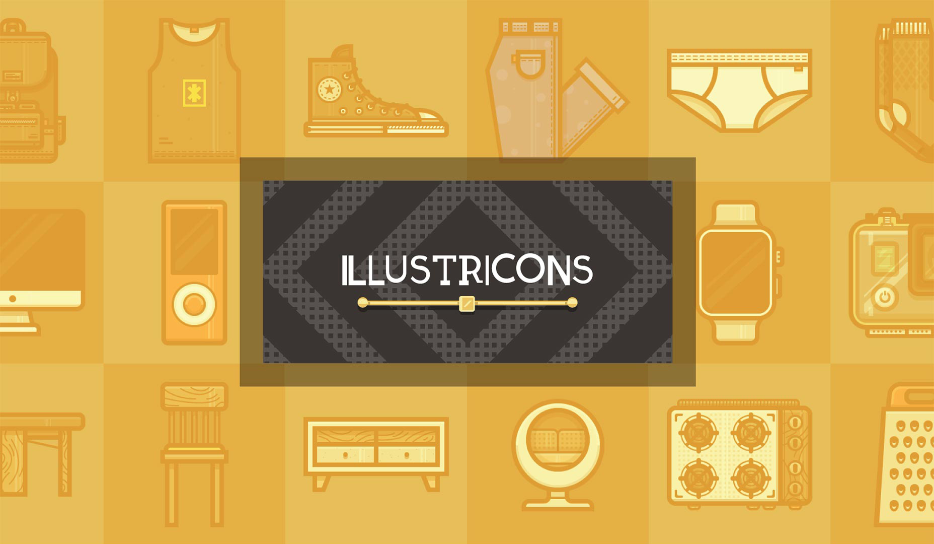
Designers rejoice! If you’ve been looking for fresh new icons to add to your collection, we’ve got a great set provided by Sliceberry. Sliceberry’s team of designers truly understand the fundamentals of icon design. This colorful set of vector icons was designed using a trendy minimalist style and each icon is packed with detail and personality. The “Illustricons” pack includes a variety of different icons from tech devices, to delectable food items and everything in between.
![]()
This is a great set of icons to have at your disposal. Simply click the like button and the icons are all yours. Make sure to follow Sliceberry on Facebook and Twitter for icon releases and offers to come.
What type of icon design do you tend to prefer? Are you more of a flat designer or a material designer? Leave a comment below.